蕨蕨 sq.fern
Designer- KuanYu Lin
︎︎︎
Creations by sq.fern start with observing life. They are a workshop that focuses on every little detail – a place where they put painstaking care into their handmade wood creations.
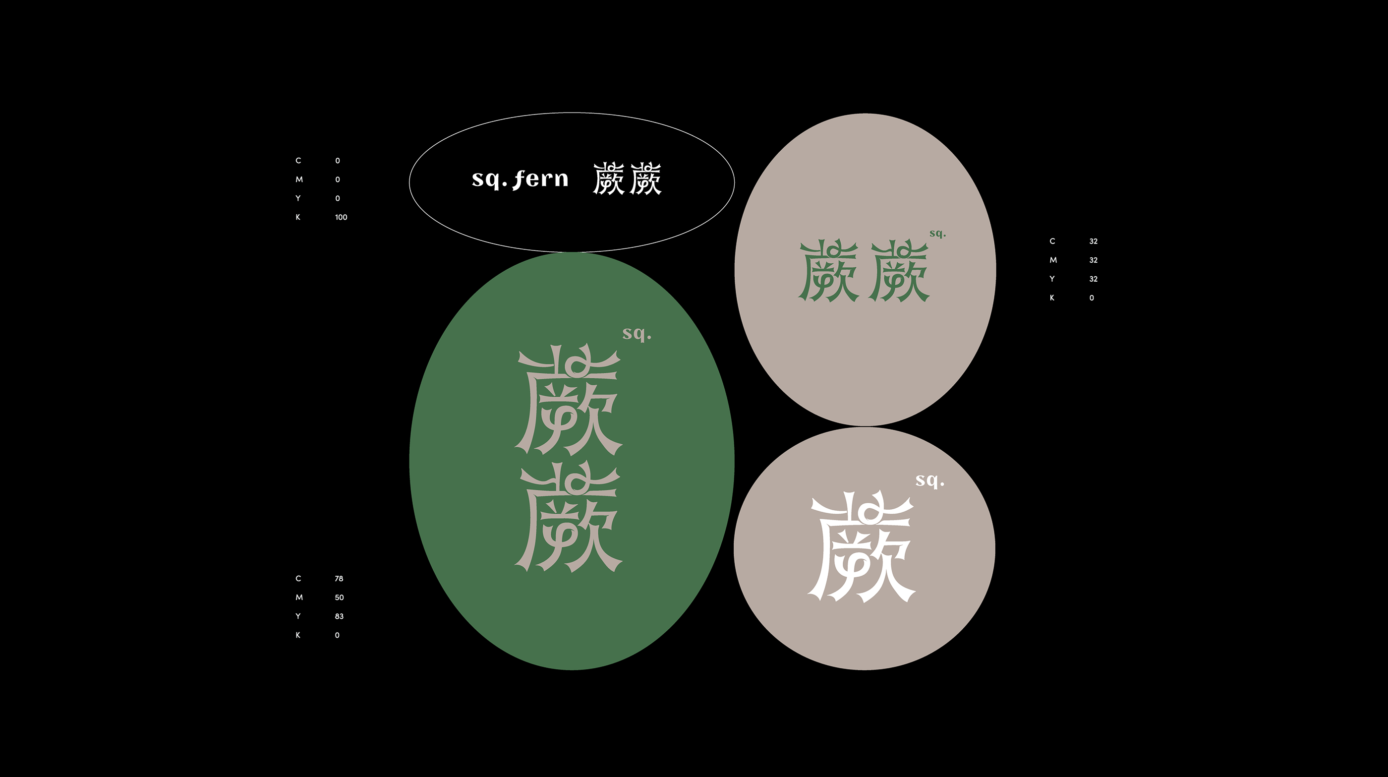
We were entrusted by sq.fern to create their new brand logo. We started with a basis in the Hei Regular font face, similar to ferns, and made adjustments from there. The type develops and transforms like a fern leaf; we used unfurled leaves on the ends of strokes, where the font face expands. We also added a sense of expansion in the middle of the strokes, to add to the contours of the fern-like font face.
蕨蕨木坊以生活中的觀察作為創作的起點,是一家專注於每個細節,並細心投入在木頭創作上的手作工作室。
此次為蕨蕨委託製作新的品牌Logo,以蕨類字體是基於Hei Regular字型的基礎下去做調整,由蕨類的葉面形狀發展變形,將展開的葉形運用在字體開散的末端,以及在筆畫中帶入分裂感,加強蕨類在字型裡的輪廓。